Spectrum Mobile
Error Messaging
Overview:
While working with the Spectrum Mobile team, I was tasked with updating the error messaging for SpectrumMobile.com.
Duration:
1 Week
Team:
Elisa Krebs, Content Design Intern
Dave Chung, Senior Content Designer
Contributions:
UX Writing
BEFORE
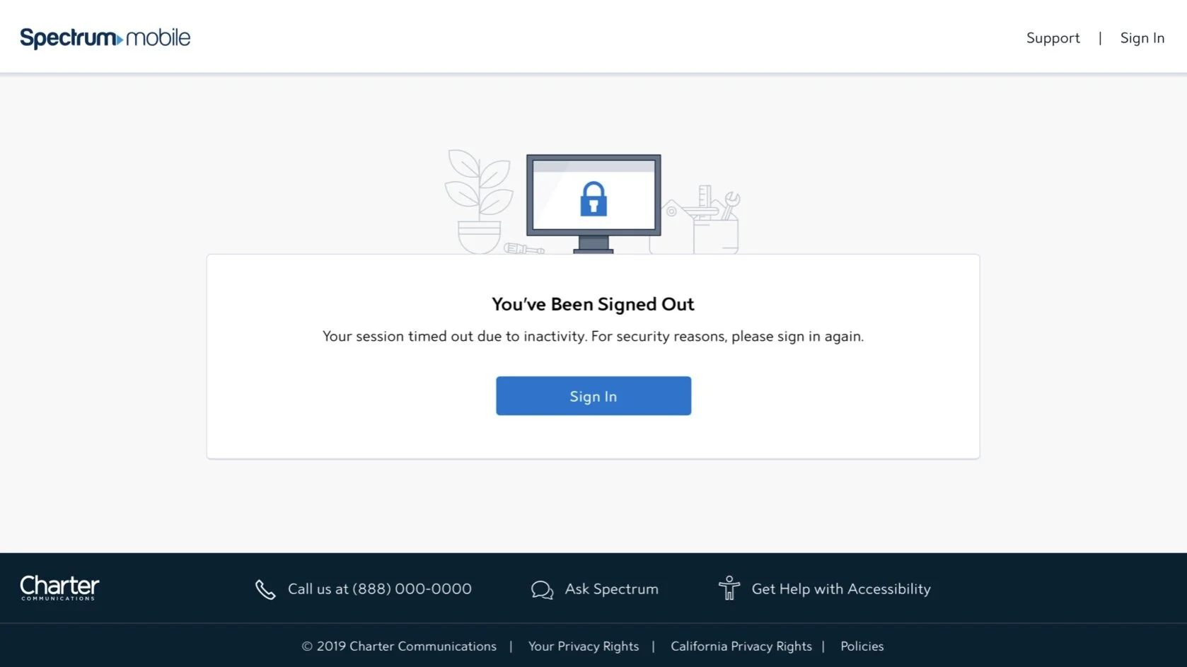
Sometimes it's necessary to disrupt a user's experience in order to protect their account. In this case, the original copy did not clearly explain what happened.

AFTER
I explained the situation in a conversational tone and updated the title to follow our style guide.

BEFORE
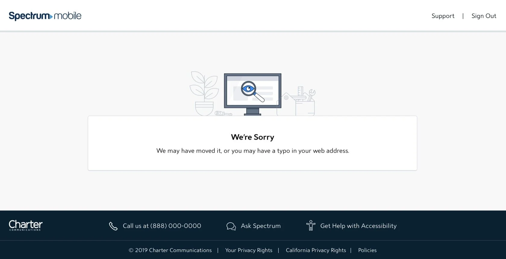
A user is likely frustrated when they encounter this error message. Our content style guide encourages us to be professional and straightforward while avoiding levity or humor.
AFTER
Our 404 message is consistent across all Spectrum platforms and products, so this copy just needed to be updated and paired with a more explicit page title.


BEFORE
This original error message told users that they didn't have access to this website, but didn't tell them why.

AFTER
I gave the user context for why the website wasn't available instead of leaving them in the dark.

A user is trying to access their new account, but can't because it hasn't been fully processed.
BEFORE
In the original message, the microcopy feels a little bit too friendly. Our style guide says to be "friendly... but not chummy" and this definitely goes a bit overboard, even down to the call to action (CTA).

AFTER
I made a more explicit title users would still know what was going on, even if they skipped the microcopy. I updated the copy to be more accurate and changed the CTA to be more professional.
